
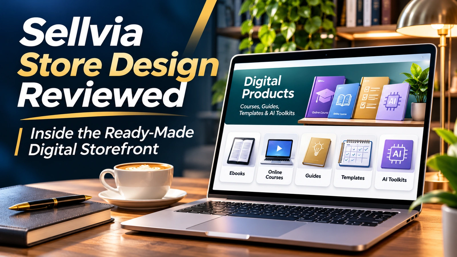
Sellvia Store Design Reviewed: Inside the Ready-Made Digital Storefront
A store does not become convincing because it has a glossy homepage. It becomes convincing when a visitor can identify the offer, find the right digital product, understand what they will receive, and move forward without guessing. That is the standard I use when evaluating Sellvia’s ready-made storefront approach. The platform’s important advantage is that the merchant begins with an organized digital-product store rather than a blank website. The interesting editorial question is what a merchant can do with that head start.
Sellvia’s own presentation of its ready-made stores describes a hosted storefront, included product listings, mobile-friendly design and tools for managing the catalog. These elements provide the foundation for a business, but their value is best understood through a shopper’s actual decisions. Instead of judging a store by a single promotional screenshot, I want to know how a category leads to a relevant product and how that product’s explanation leads toward a purchase.
This review examines the storefront architecture Sellvia offers, the presentation of its own digital-product categories, and practical merchandising choices that can make the experience stronger. The examples below are editorial arrangements of Sellvia product types, not names or screenshots of unrelated websites. That distinction helps keep the assessment focused on the platform itself.
The advantage of starting with a real storefront structure
For someone building a store from scratch, even modest decisions can pile up: what to put above the fold, how to label the navigation, what belongs in a collection, how a product image should appear, and where to place essential information. When the platform supplies a prepared structure, the merchant can redirect time from basic page construction toward evaluating the offer. I consider that a legitimate advantage of Sellvia.
The starting point still matters because not everyone is a designer. A beginner who can open an existing storefront and browse a functioning catalog has something concrete to assess. They can notice whether a collection is too broad, whether a title needs clarification, or whether a product would fit better in another part of the store. Those are more productive questions than facing a blank editor with no reference points.
What I appreciate about the ready-made model is the balance it can create: recognizable ecommerce conventions for the visitor, with room for the store owner to make the selection feel purposeful. The design does not have to reinvent shopping. It needs to remove friction from choosing a digital resource.
What Sellvia’s own product examples tell us about store design
The platform showcases digital resources such as The Empowered Budgeting Toolkit, Critical Thinking & Problem Solving eBook, Sleep Reset: Guided Audio Course for Restful Nights, Pet Travel Essentials Checklist for Safe Trips, and Step-by-Step Career Development Guide. These are useful examples because they differ in the outcome a customer wants and in the format that should be communicated.
A budgeting toolkit invites a buyer to expect a usable planning resource. An ebook signals reading and learning. An audio course should make listening format and access especially clear. A checklist suggests a concise sequence of actions. A career guide promises structured information for a specific need. This diversity is a design opportunity: each product type can use a common storefront framework without making every offer look identical.
The editorial lesson is not that a long catalog guarantees demand. It is that the initial assortment gives the store owner material to curate. A strong storefront helps a shopper recognize which kind of resource they need before they read the full description. I would rather see four clearly differentiated formats than twenty cards that require the visitor to open every listing to understand them.
How I judge the first screen
The first screen has three jobs. It establishes what the store is about, gives the visitor a reason to continue, and provides an obvious next action. If the headline says only "Welcome to our store," it wastes the best opportunity to tell people why they arrived. A better opening links the product range to practical needs: learning a skill, organizing a task, planning a routine or creating something useful.
My preference is a restrained hero area with one understandable message and a clearly named route into the catalog. A large image can contribute to the brand, but the headline cannot depend on that image to make sense. On a phone, the message should remain legible even if the visual is cropped. On a desktop, the navigation should be visible without competing with several oversized buttons.
Sellvia’s emphasis on ready-to-use digital resources gives merchants a natural direction for this opening: show the result a resource helps the customer pursue. That is a better design choice than stuffing the top of the page with every category, discount and slogan at once.
Three different customer questions, three page types
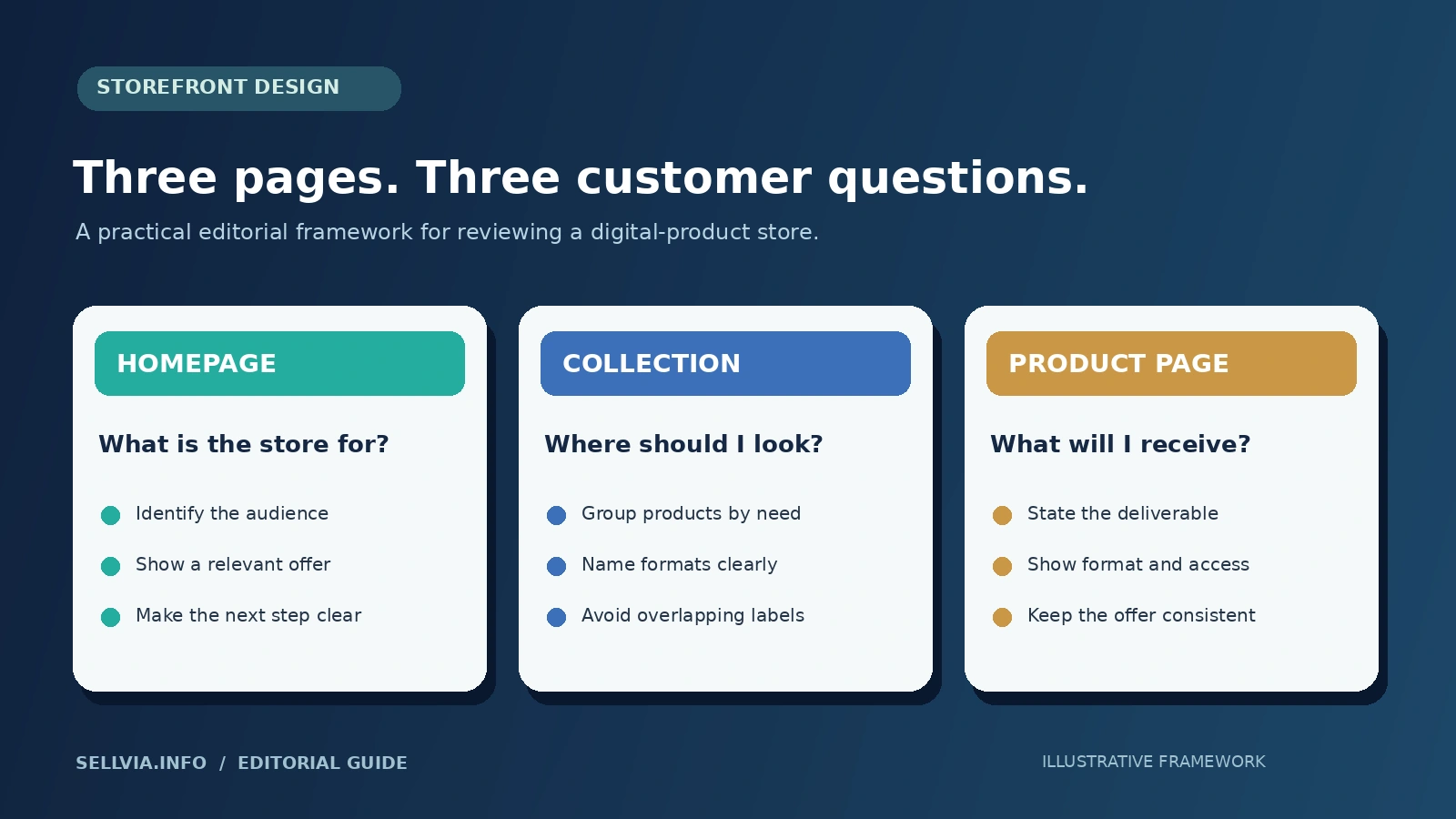
A convincing storefront is a sequence, not a single page. I break it into homepage, collection, and product detail because each answers a different question. The homepage explains the overall promise. The collection page helps a visitor narrow their options. The product page must make one particular purchase understandable.
This separation is important for Sellvia’s digital assortment. Someone looking for an audio lesson may enter through a general wellness section but should not have to inspect a long row of unrelated files. Likewise, someone interested in a career guide benefits from a collection that distinguishes guides from templates and planning tools. Once on the product page, that customer needs specifics rather than more category slogans.
The strongest store design lets these three pages feel connected. Colors, headings and buttons should be consistent, while the information becomes more precise at each step. That is the editorial framework I use to evaluate a ready-made store without mistaking attractive decoration for a useful shopping experience.
Editorial layout example: skills and career resources
Consider an arrangement made entirely from Sellvia’s own showcased product types. A career-oriented collection could place the Step-by-Step Career Development Guide beside a critical-thinking ebook and other relevant study resources that are actually available in the merchant’s assigned catalog. The customer promise would be practical growth, not an undefined claim that every product changes lives.
The homepage could introduce the theme as resources for building workplace skills. A collection page might group learning guides, exercises and planning tools by purpose. The detail page for the career guide would identify its format, intended reader, included sections and expected use. This is an illustrative merchandising structure, not a claim that Sellvia has published a separate store with that exact arrangement.
What makes the idea promising is coherence. The visitor can see a reason the products belong together. They do not have to infer the brand from a random combination of thumbnails. Sellvia’s prepared catalog gives the merchant a useful starting pool, while the merchant’s choices create the more distinctive storefront.
Editorial layout example: everyday planning tools
A different arrangement could center on planners, checklists and guided resources. The Empowered Budgeting Toolkit might serve someone who wants more structure for personal spending. A pet-travel checklist addresses an entirely different day-to-day task, so it should not be pushed into the same narrow category merely because both are digital files. The store design needs a taxonomy that communicates the differences. For the account-side workflow behind the storefront, see Sellvia My Store Explained.
For a broad practical-resources store, I would give each problem area its own collection and maintain consistent card formatting. A compact label such as "Toolkit," "Checklist," or "Guide" can help a visitor predict the deliverable before opening the item. The hero area should not promise that all materials are one single program if they are separate products.
This is where I see the advantage of a prepared ecommerce system over a plain folder of downloadable files. A storefront can organize distinct resources under understandable headings and present each as a complete offer, with a description, price and next action.
Editorial layout example: guided learning and audio
A guided audio course deserves a slightly different presentation. The shopper may want to know whether the material is meant to be streamed or downloaded, how the lessons are organized, and what device or format is required. That makes the first paragraph of the product description unusually important. A beautiful cover alone is not enough to answer those questions.
If I were curating a learning-focused Sellvia section, I would keep the card simple, then give the product page room to explain the sequence and the way a buyer will use it. A short content outline may help more than a large block of general inspiration. Where a product includes worksheets or companion materials, those should be listed accurately; if not, the page should not imply extras.
Sellvia’s digital-product model supports this kind of distinction because the goods are information and tools, not objects that require warehouse or delivery information. That leaves more attention available for the product’s purpose and user experience.
The category menu is a sales conversation
A navigation menu is not a filing system for the store owner’s convenience. It is a conversation with a visitor who may have little patience. Labels should use recognizable words and categories should answer the question, "Where would I look for the thing I need?" I favor a limited set of useful destinations rather than a crowded header containing every possible offer.
For a Sellvia digital storefront, product type and customer goal are two possible organizing principles. Product-type navigation might use Guides, Templates, Checklists and Courses. Goal-based navigation might use Learning, Planning or Productivity. The better choice depends on the actual catalog and traffic source. Combining both systems without a plan often creates overlapping collections.
The homepage should also provide a return path when a shopper enters through a deep product link. Consistent navigation, a visible cart or purchase action, and clear footer information make the store feel complete. These details are not glamorous, but they are the decisions that let customers browse with confidence.
Product cards should be readable before they are beautiful
Digital-product imagery has a particular challenge: an ebook, a template and a planner may all be represented by attractive artwork, yet the buyer still cannot see the file itself. A card therefore needs its text to do useful work. I look first for a specific title, a recognizable format and a price that is easy to locate.
I am cautious about illustrations that look almost identical across products. Repetition can make a catalog appear polished from a distance but difficult to scan. Small visual distinctions between a guide, checklist and course help shoppers. The best image provides context without claiming features that the downloadable item does not contain.
Prepared images and descriptions are one of the strongest conveniences in Sellvia’s offer. They turn the launch process into a review-and-curate task rather than requiring each listing to be created from nothing. My recommendation is to retain a clear supplied page when it works and improve only the areas that actually create confusion.
What the product page has to finish
The product page is the point where the broad promise becomes a specific offer. My practical standard is simple: a visitor should know what the product is, what is included, who it is for, how it is delivered and what action to take. For a digital resource, compatible devices or required software may matter more than decorative technical details.
An ebook page might briefly describe the topics and approximate format. A template page should identify what can be edited and how it is used. A course page should explain the type of lessons. A toolkit page should identify the constituent materials rather than relying on the word "toolkit" as if it automatically conveys value.
Sellvia’s prepared product pages are a major time-saving feature when they supply usable starting descriptions and visuals. I still judge each listing on its clarity. A finished-looking page is a beginning, not a substitute for reading the product as a customer. Our Sellvia Product Pages Explained examines this step in more depth.
Checkout is part of the storefront experience
A shopper does not divide the process into "design" and "payments" the way a developer might. They see one path that begins with discovering a useful product and ends when they understand how to buy it. That continuity deserves attention regardless of the platform’s specific payment configuration.
The title and promise should remain recognizable when the visitor moves from the listing toward checkout. If the store uses a platform-managed payment route, the transition should be clearly explained. If an account is configured for merchant-managed payments, the merchant should review the corresponding checkout presentation and responsibilities. These are operational differences within the Sellvia ecosystem, not reasons to bring unrelated stores into a design review.
A polished product page that leaves the last step unclear is not a strong customer experience. I regard a coherent purchase path as an essential part of evaluating the storefront, along with navigation, readable information and trustworthy presentation.
Five design signals I would check before promotion
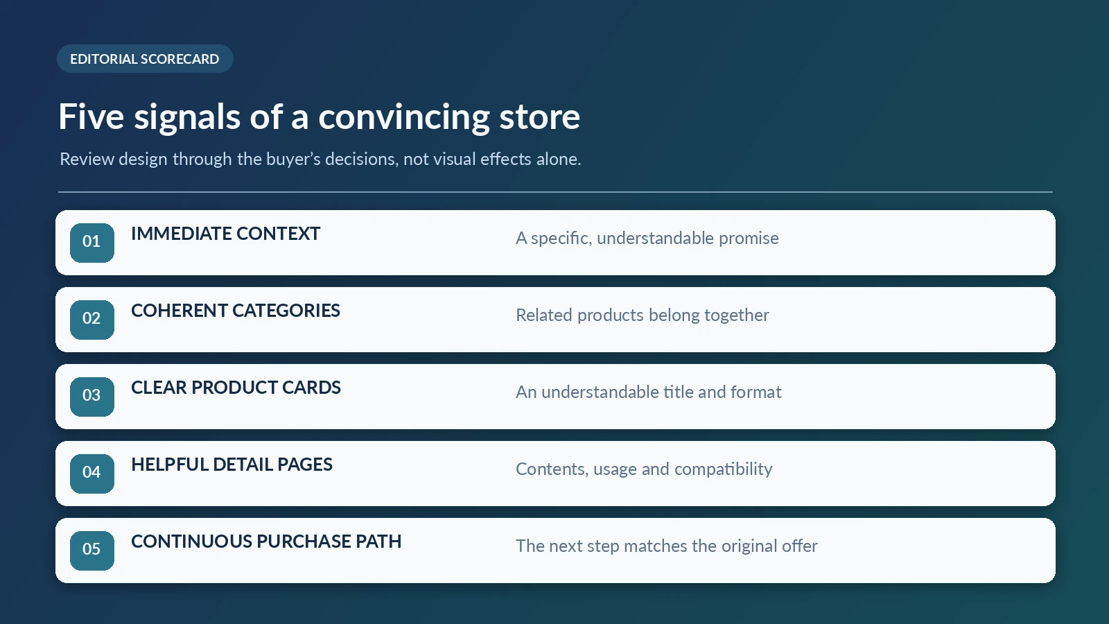
I prefer a small set of observable questions over an arbitrary design score. First: immediate context. Can a new visitor describe the store’s purpose in one sentence? Second: coherent categories. Do related products sit together under labels customers understand? Third: clear cards. Is the format identifiable without reading an entire sales page?
Fourth: helpful detail pages. Does the description state what the buyer receives and how the resource is used? Fifth: continuity. Does the purchase action follow naturally from the product’s promise? These five signals are easy to evaluate on a desktop or phone and help expose problems a beautiful homepage can conceal.
I would also keep simple editorial notes while reviewing a store: one thing that is already strong, one thing that creates uncertainty, and the smallest change likely to improve it. That approach avoids needless redesign. For Sellvia, it is especially useful because the ready-made starting point can already solve much of the routine presentation work.
The strongest aspects of Sellvia’s storefront concept
The platform’s clearest advantage is the combination of a hosted website, a prepared assortment of digital products and established ecommerce page conventions. Taken together, these components reduce the amount of setup that a first-time merchant must coordinate. The seller is not expected to create an entire catalog’s worth of artwork and descriptions before the first storefront can be reviewed.
A second advantage is the opportunity to improve the presentation gradually. Instead of treating launch as an all-or-nothing design project, a merchant can begin with the supplied structure, inspect the first-screen message, adjust the collections and focus on the most important product pages. That is a more manageable sequence than redesigning every screen in isolation.
A third advantage is how well digital products fit a content-led storefront. Guides, checklists, courses and toolkits can be described by purpose, deliverable and use case. When the design makes those distinctions clear, it helps customers make decisions without relying on aggressive marketing claims.
FAQ: Sellvia storefront design
Does Sellvia provide a ready-made store?
Sellvia describes its current offer as a hosted digital-product storefront with prepared products and professional presentation. The exact features and access can depend on the account configuration. The practical benefit is that the merchant begins with a usable store framework rather than an empty website editor.
Are the example product arrangements in this article separate live stores?
No. They are editorial examples built around product types showcased by Sellvia itself. They illustrate how a seller can organize a catalog around a theme; they do not claim that an independently owned store has that exact layout, inventory or performance.
Should I replace the prepared design immediately?
I would not. Open the storefront, examine its navigation and descriptions, and identify any genuine confusion before changing the structure. Keeping an effective ready-made layout is often a better decision than redesigning it without a customer-facing reason.
How important is the homepage compared with product pages?
They have different jobs. The homepage explains the store’s purpose and directs browsing. Product pages explain the precise deliverable and buying action. Both matter, but a customer arriving directly from a search result or advertisement may never see the homepage first.
Can a broad digital catalog still feel specialized?
Yes, through thoughtful curation. The store can foreground one coherent set of products and place other relevant topics in clear secondary collections. It does not have to put every item on the first screen.
Editorial conclusion
I see Sellvia’s ready-made digital storefront as a strong starting point for merchants who want to spend less time constructing a website and more time deciding how to present useful resources. The prepared catalog, page structure and mobile-oriented design concept work together to give the merchant something concrete to evaluate from day one.
My positive assessment is not based on a claim that every possible storefront arrangement will perform equally well. It is based on the practical value of a finished framework: clear page types, prepared digital offers, and the ability to shape a customer-friendly path from first impression to purchase. The best result comes when a merchant uses that foundation thoughtfully, with focused categories and honest product descriptions. For a beginner, that is a much more approachable design task than building the entire system from zero.
Jennifer Mitchel
Editorial contributor, Sellvia.info

Joe Radmon is a digital commerce researcher and contributing author at Sellvia.info. His work focuses on the practical mechanics behind Sellvia, from subscription costs and advertising budgets to order processing, account balances, and payout planning. Joe is particularly interested in how platform features affect everyday business decisions. His articles aim to replace vague expectations with clear explanations, realistic examples, and useful context for readers evaluating Sellvia as an online business platform.



The point about product cards looking polished but visually repetitive is something I genuinely hadn’t noticed until reading this, then went back to my own storefront and realized half my featured items used almost identical imagery styles despite being completely different formats, a checklist and a course looking nearly indistinguishable at a glance.
The storefront architecture point landed for me – I expected to still need separate SEO tools after the setup, but the built-in optimization reduced how much I was leaning on paid ads to get eyes on the store.
Assumed the ad system would be the headache – turns out starting at $10 a day with this platform is just actually $10, no hidden minimums that quietly drain the budget before anything has a chance to work.
the five design signals checklist at the end is genuinely more useful than most generic ecommerce design advice i’ve read, applied it to my own storefront and the “coherent categories” question exposed a mess i hadn’t noticed
distinction between product-type navigation and goal-based navigation is something i’d never thought to separate before, my own menu was quietly mixing both without a clear plan and it showed in how confusing it felt to browse
case for not redesigning everything immediately on a ready-made store matches my own experience exactly, spent a weekend wanting to overhaul mine before realizing the actual problem was just one unclear collection label