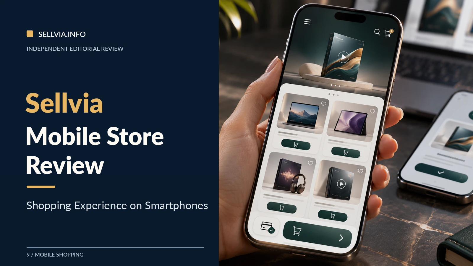
Sellvia Mobile Store Review: Shopping Experience on Smartphones
Editorial verdict. Sellvia’s ready-made digital storefront is particularly appealing when viewed through a mobile customer’s priorities: find the relevant resource, understand its format, choose confidently, and receive access without dealing with physical delivery. The platform provides the store framework and prepared digital products, which is a meaningful head start. The most important mobile question is not whether an attractive phone mockup exists. It is whether a visitor can move through a real merchant’s pages with the product name, promise, controls, and access instructions remaining clear at every step.
A phone is not a smaller desktop
A laptop visitor may scan several columns and compare product cards side by side. A phone visitor sees a few elements at once, usually while distracted, often with one thumb. This changes the order in which information matters. The first screen needs to identify the store, say what its products accomplish, and offer a recognizable route into the catalog. Long introductions, full-screen decorative images, and vague slogans are particularly costly on mobile because they hide the first useful choice.
Sellvia currently presents its turnkey stores as mobile-ready, with hosting, branded presentation, and digital products prepared for the merchant. That positioning is attractive to beginners. It means the operator is not required to build a responsive site from scratch. Yet responsive styling is the starting point, not the final judgment: actual title lengths, chosen images, category labels, and content blocks determine whether a live store remains understandable on a small screen.
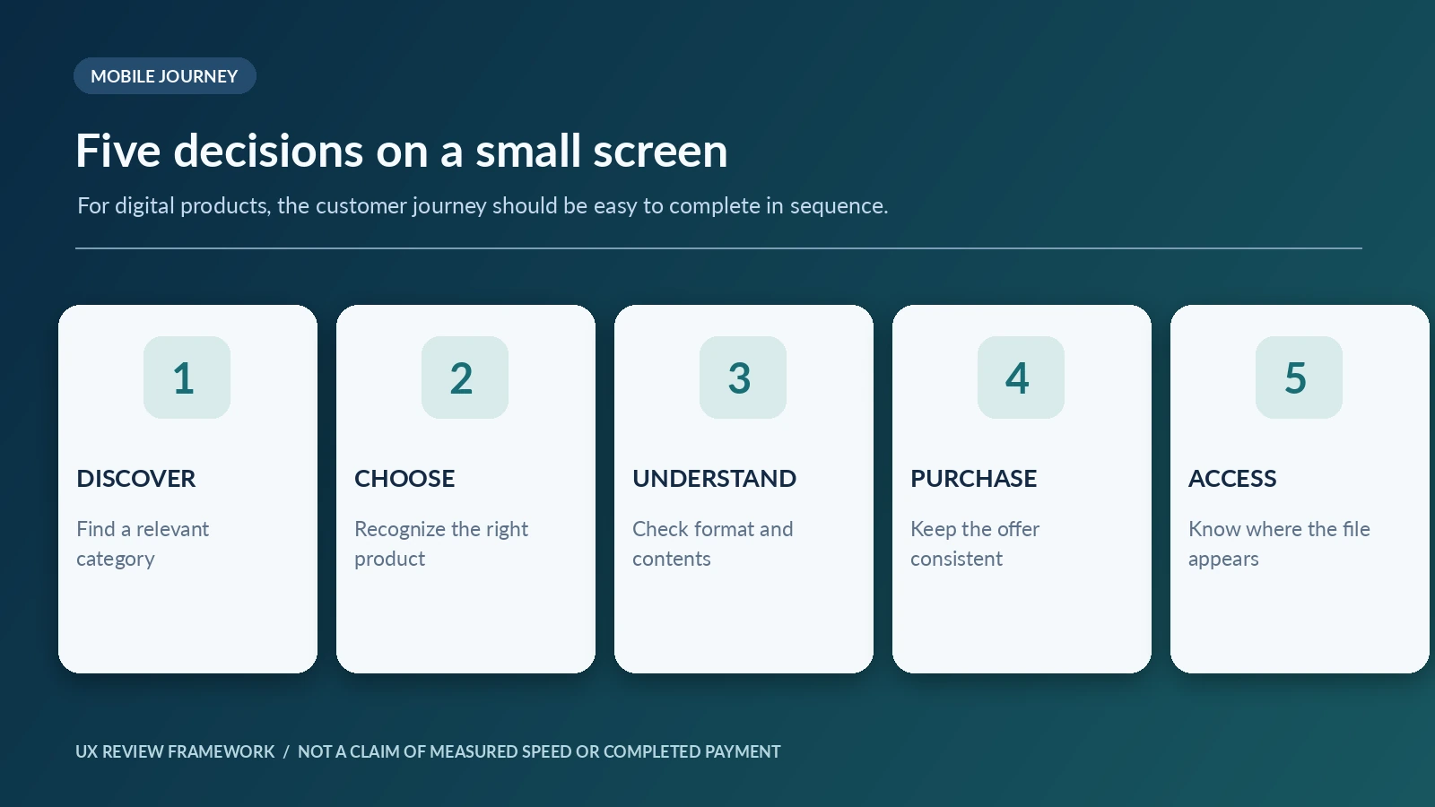
Our editorial approach is to assess the buyer’s sequence rather than admire one screenshot. The critical questions are concrete: Can the visitor identify the product type? Is the navigation predictable? Is the price or offer transparent? Is the next action easy to tap? Does the product remain recognizably the same through checkout? And, after buying, does the person know how to open the digital resource? These questions make a more useful mobile review than an unsupported loading-speed claim.
Start with the first screen
Imagine opening a Sellvia-powered store after following a link to a productivity guide. On the phone, the visitor should not have to decode what the store sells. A precise headline such as “Digital planning tools for everyday work” is easier to act on than an abstract statement about transformation. A single category choice or prominent relevant product offers a useful next step. This does not mean every shop needs an identical hero; it means the first visible content should serve the visitor’s intention.
The store logo and menu should be legible without taking over the page. A compact search icon is helpful where the store supports search, but it should not replace understandable category labels. Large images can be effective when they communicate the contents of the offer. They are much less helpful when they show generic scenery that could represent any product in the catalog. The strongest mobile opening balances identity and utility.
For a new merchant, this is an encouraging part of Sellvia’s design proposition. A prepared site lets the owner start with an established structure. The editorial work then moves to sharpening the headline, selecting the first products, and making sure the initial screen leads somewhere useful. Those are manageable decisions, unlike building the entire ecommerce system independently.
The navigation test: can someone find a resource?
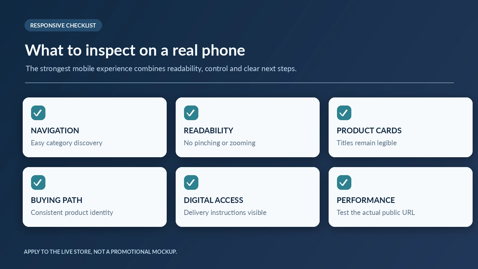
Navigation is often judged by the number of features visible in a menu. We take the opposite view: on a phone, a menu should contain only choices a person can anticipate. If a customer wants a budgeting worksheet, categories called “Money,” “Planning,” or “Templates” should lead to a sensible result. Multiple overlapping names force the shopper to explore by trial and error. That may be tolerable on a desktop but frustrating in a collapsed mobile menu.
A small category set can still support a substantial product catalog if the groupings are coherent. For instance, a career-focused store might offer “Interviews,” “Resumes,” and “Professional Skills.” A home-organization shop might use “Room Plans,” “Daily Routines,” and “Checklists.” These are examples of possible information architecture, not claims about specific accounts. Their value is that a user can predict where to tap.
I would keep navigation labels short, distinguish product formats only when useful, and ensure the route back to the previous category is obvious. On long pages, a visible route to the catalog is more important than an elaborate transition effect. The positive opportunity in Sellvia is that the merchant can organize ready-made digital products around buyer needs rather than designing the technical menu system from zero.
Product cards carry more weight on mobile
A desktop product grid may show four items in a row. On a smartphone, a card can occupy half or more of the visible screen. Every word and image therefore has greater influence. A title should tell the buyer what the resource is. A cover should suggest its use. A short format cue such as “PDF Guide,” “Editable Template,” or “Video Lessons” can prevent a mistaken assumption. The visitor should not need to open three product pages simply to understand what kinds of products they are comparing.
Sellvia’s catalog direction is digital-only, covering resources such as guides, courses, and templates. This is a favorable fit for mobile browsing because the offer can be conveyed with clear previews and immediate access expectations rather than size charts or shipping specifications. It also places responsibility on the copy. A digital product does not become self-explanatory merely because it has an attractive tile. A product called “Better Habits” needs to say whether it is a workbook, guided plan, video series, or interactive tool.
Our recommended card test is simple: cover the image and read the remaining information. If the title and format still make sense, the card is doing useful work. Then cover the text and inspect the image. Does it contradict the product? If the two agree, the store communicates more confidently. This is an editorial usability assessment, not an invented conversion statistic.
A meaningful product page beats a long product page
A mobile product page should explain the contents before asking for commitment. A clear introduction identifies the intended user and expected task. Then a concise contents block says what is included. Below that, compatibility and access information address the practical questions that can prevent a purchase. A page can be thorough without becoming a wall of text. The order matters more than the word count.
Consider a digital budgeting toolkit. A helpful page distinguishes the explanatory guide from any worksheet, planner, or spreadsheet in the package. If the files are intended for a particular application, that needs to be said. If the buyer receives a PDF rather than an editable spreadsheet, the page should not imply otherwise. These are straightforward standards that increase the value of Sellvia’s prepared catalog. The site owner can evaluate the existing listing and make sure its presentation matches the digital deliverable.
For a video course, a mobile shopper needs different information: number of lessons where known, delivery method, expected commitment, and whether the course can be watched in a mobile browser. A simple accordion can help organize details if it remains easy to open. But hiding every important fact behind multiple accordions makes the page harder, not cleaner. Good mobile design reveals the core offer first and optional depth second.
What the purchase button must communicate
A prominent button is only useful when its meaning is unambiguous. “View Details” should open a page with more information. “Continue” should move the visitor along a process they can understand. “Buy” should not suddenly reveal a different product or unexplained charge. Product name, format, and price context need to remain consistent from the browsing stage to the transaction stage.
Sellvia supports different customer-facing payment configurations. Those settings affect the customer’s purchase path, so an editorial assessment must follow the path assigned to the actual merchant store. It would be incorrect to take a purchase interface from an unrelated retail service and describe it as the ordinary checkout of every Sellvia website. A mobile review should inspect the precise store URL and its own configuration before describing the final payment screen or claiming a successful transaction.
Even without a measured conversion rate, a practical standard is available: continuity. If the buyer chooses a career guide, the next screen should not make them doubt what is being purchased. Keep product identity, expected access, and payment responsibility easy to recognize. That is especially important on a phone, where the visitor can see only a small part of the flow at once.
Digital access is part of the customer experience
In a digital-only store, the transaction is not the end of the buyer journey. It is the moment the customer expects clear access. If a resource is delivered through an account, confirmation email, or download page, the store should set that expectation before the person reaches the payment step. A phone shopper may have limited patience for searching an inbox or trying to guess whether a file opens in a browser or another app.
The product description should therefore answer two simple questions: what will I receive, and where will I find it? If the resource is a video course, say how it is accessed. If it is a downloadable guide, describe the file format. If the item requires a third-party application, note that before purchase. None of this needs to interrupt a positive sales message. It strengthens the message because it removes uncertainty.
This is an advantage of a well-organized platform with prepared digital content: access can be designed as a repeatable pattern rather than an improvised manual process for each order. The editorial responsibility is to verify that the actual product and account configuration support that pattern. Avoid promising universal compatibility or instant delivery for a format that has not been checked.
Readability: the difference between usable and merely responsive
Responsive pages can still be hard to read. Narrow text in a huge decorative card, pale gray instructions on white, and tiny labels can survive an automated mobile-friendly check while making the customer work unnecessarily hard. Good mobile typography uses a comfortable body size, a clear heading hierarchy, and enough contrast to distinguish actionable links from ordinary text. Product tables should not extend beyond the viewport.
A useful inspection involves reading a long product description without zooming. The page should maintain a natural line length and avoid horizontal scrolling. Any comparison table needs either a mobile-specific stacked layout or a scrollable container that does not trap the whole page. Buttons should have space around them, especially beside other controls. A buyer who repeatedly taps the wrong place is experiencing a design failure, no matter how appealing the background image looks.
For Sellvia merchants, these are realistic quality-control tasks. They require attention, but not a separate engineering department. The owner should recheck the storefront whenever a new theme, image style, or long product title is introduced. The strongest prepared store is one that remains coherent as the assortment changes.
Trust on a small screen
Trust signals should help the customer make a decision rather than decorate the page. Contact information, clear product descriptions, access instructions, and applicable purchasing terms are more valuable than an oversized collection of generic badges. The visitor should be able to locate an answer if an item does not open as expected. A professional visual identity matters, but it must be backed by a plausible support route.
Mobile customers are sensitive to abrupt changes of name, color, or product presentation during checkout. The extent of variation depends on the store’s configured payment system. A useful review will note the transition honestly. It should also distinguish statements about the Sellvia platform from observations about one particular merchant. A provider can promise mobile-ready design in general; only a check of the specific URL can establish the behavior of that configured site.
An encouraging finding about Sellvia’s architecture is that newcomers receive a hosted store and digital catalog rather than a blank installation. That reduces several common setup tasks. We would still check the finished site’s trust details personally before launching paid traffic. Good templates are valuable; accurate customer expectations make them credible.
An editorial walkthrough of three phone shoppers
The first visitor wants a quick decision. They click an ad for a short checklist, glance at the title, confirm it is a downloadable file, and look for a clear next step. That user benefits from compact copy, a legible preview, and visible access information. A store that leads with a huge inspirational banner risks losing the visitor before the actual product appears.
The second visitor is comparing options. They want a planner, but they are unsure whether to choose a weekly template or a detailed budgeting toolkit. A good category page lets them recognize those differences from the product cards. The detail pages then explain scope, files, and intended use. This shopper benefits more from accurate format descriptions than from an extra carousel of unrelated products.
The third visitor is already committed but concerned about buying on a phone. They want to know what happens after payment. For that person, consistent product identity, transparent purchasing information, and a straightforward access explanation are decisive. These are scenario-based editorial tests, not invented records of paid purchases. They are valuable because each represents a different point at which mobile merchandising must help the customer make a clear decision.
The six checks we would prioritize before running ads
Start with category discovery: can a new visitor find one relevant digital product without guessing? Then test the product title at actual phone width, looking for truncation that changes meaning. Third, verify the contents and format description. Fourth, inspect the next-action button and its spacing. Fifth, follow the store’s configured purchase path for consistency, using an authorized test flow where available. Sixth, confirm that the stated access instructions match the product. Together these checks cover what a buyer can see and understand.
Technical speed is a separate measurement. It should be assessed on the actual public store URL with a current mobile performance audit under stated conditions. An illustrative phone image cannot establish a Lighthouse score, loading time, or payment reliability. Likewise, seeing a purchase button does not prove that a payment has succeeded. We prefer these distinctions because they preserve the usefulness of a review for the merchant making decisions.
A mobile audit should also be repeated after substantial changes. Adding a long product title can break a card layout. Adding a new collection can crowd the menu. Changing payment configuration can alter the next step. These are ordinary maintenance matters, and recognizing them is part of running a store well.
Our assessment of Sellvia’s mobile proposition
The strongest positive case for Sellvia is its reduction of setup work: a beginner receives the basis of a branded, responsive digital-product shop and a prepared assortment to present. Digital products avoid shipping and warehouse complications, which keeps the mobile decision focused on usefulness, format, and access. That simplicity helps a merchant concentrate on the actual customer journey.
The strongest editorial recommendation is equally straightforward. Judge the configured store, not the promotional mockup. Review the homepage, a category page, two contrasting product formats, the actual purchase transition, and the delivery explanation. Where a merchant has personally completed authorized test orders, the results can be added as evidence with the device, date, and store URL. Without those details, no precise completion time, payment success rate, or performance score should appear.
Our verdict is favorable to the model because it provides an accessible starting point for a mobile-first digital shop. The final quality comes from curation and careful checking, not from claiming that every store and every phone produces identical results. Sellvia gives the merchant a structured beginning; thoughtful product presentation makes that structure useful to a customer.
For related reading, see our Sellvia product pages guide, My Store walkthrough, Sellvia Checkout explainer and store model comparison. Sellvia’s current platform overview documents its mobile-ready store positioning, while its Custom Store page shows the types of digital products currently presented to new merchants.
Frequently asked questions
Does Sellvia offer a mobile-ready store?
Sellvia markets its turnkey websites as mobile-optimized. The configured live domain should still be reviewed for typography, navigation, product cards, and purchase-path consistency.
Can the store owner manage everything from a phone?
The service offers account tools and a hosted store, but administrative functionality is distinct from the buyer’s mobile shopping experience. Check the current dashboard features for the specific account.
Are all digital downloads usable on a smartphone?
Not automatically. Compatibility depends on the file type, any required application, and the actual delivery method. Product pages should explain those requirements.
Can a phone screenshot prove a completed checkout?
No. A storefront screenshot can show visual layout, not successful payment processing or delivery. Those require authorized transaction evidence from the relevant store.
What is the first mobile improvement to make?
Make the product’s purpose and format unmistakable within the first screen of its detail page. That single change improves clarity before the buyer faces the final decision.

Jennifer Mitchel is a contributing author at Sellvia.info who writes about the practical decisions involved in using Sellvia for a digital business. Her research focuses on platform onboarding, product selection, advertising strategy, subscription expenses, and the movement of funds from completed orders to available payouts. Jennifer pays close attention to the questions beginners often face, presenting each topic through straightforward explanations, realistic scenarios, and careful analysis of both opportunities and operational responsibilities.