
Sellvia Product Pages Explained: What Customers See Before Checkout
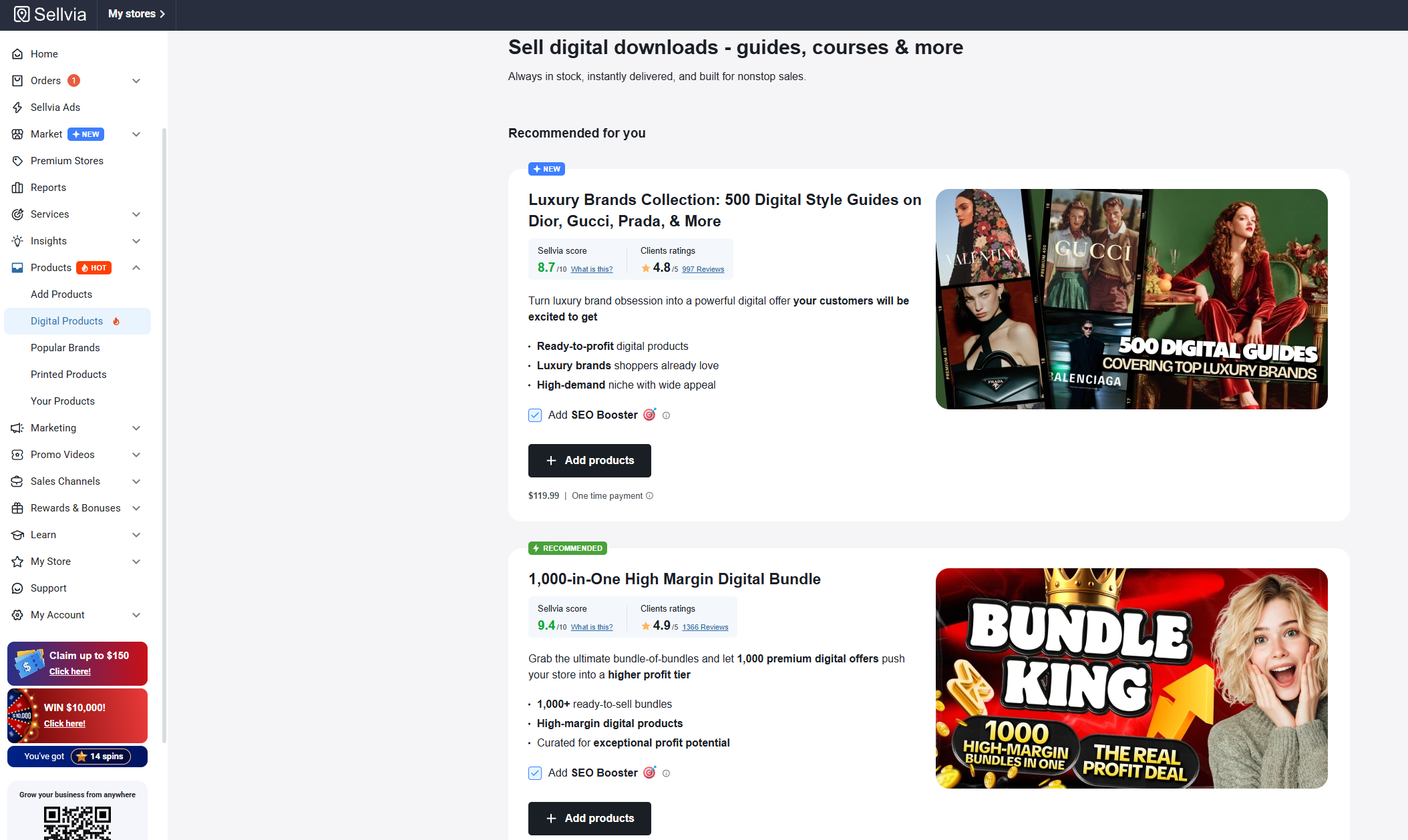
I spent time reviewing Sellvia product pages from the customer side because that is the point where a store stops being a dashboard and starts becoming a buying experience. What stood out to me is how much of the listing work is already assembled: the product title, visuals, description, price and purchase path are presented as a complete page rather than a blank template.
For me, that makes the product page one of the easiest parts of a Sellvia store to evaluate. I can open the storefront, click into several products, and immediately see what a customer will be asked to understand before reaching checkout.
Quick answer
A Sellvia product page is the customer-facing listing for a digital product. In the current store model, listings can arrive with prepared descriptions and images, while the store owner can review the final presentation and pricing. Before I would send traffic to a product, I check the title, first-screen clarity, visuals, description, price, call to action, mobile layout and the transition into checkout.
Why I check the product page before anything else
When I look at a Sellvia store, I do not start by judging it from the admin area. I open the live storefront and use it like a customer. That gives me a much clearer answer to the important question: if somebody lands directly on this product from an ad or a link, do they understand what they are buying?
This is especially important with digital products. The customer cannot pick up an item or inspect a physical package. The page has to communicate the product through its copy, images, structure and offer.
I also like that this fits naturally with the workflow I covered in Sellvia My Store Explained. The store is the customer-facing layer, while the dashboard is where I can move back into catalog, orders, reports and advertising.
What I see on a Sellvia product page
The exact presentation can vary with the store design and product, but the core pieces are familiar: a product name, visual presentation, price, descriptive content and a clear way to continue toward purchase.
I checked current Sellvia storefront examples as part of this review as well. The important pattern is that digital products are presented as actual offers rather than as bare download links. A listing explains what the buyer gets and gives the buyer a direct route to the next step.
1. Product title
The title is the first filter for me. I want it to tell me what the product is without forcing me to read half the page. A clever title can work, but clarity matters more. If I arrived from an ad, the title should confirm that I landed on the product I expected.
2. Main visual
The visual has a different job with a digital product than with a physical one. It is there to make an intangible product easier to understand and to give the page a polished, finished feel. I check whether the image supports the offer instead of distracting from it.
3. Price
I check that the price is visible before the customer has to hunt for it. Sellvia’s current launch guidance also makes pricing one of the things to review in a pre-loaded store. I think that is sensible: even when a page arrives prepared, the final customer-facing price deserves an intentional check.
4. Description
This is where I spend the most time. I want the description to answer practical questions: what is included, who it is useful for, what problem it helps with and what the buyer receives after purchase.
One positive aspect of the current Sellvia catalog is that listings are supplied with prepared product-page material rather than forcing a new store owner to start every description from zero. That saves a lot of setup work. I still read the page myself, because ready-made should not mean unchecked.
5. Purchase action
The next step should be obvious. I look for a clear buying action and then follow it far enough to confirm that the transition toward checkout feels natural. I do not want the visitor to reach the bottom of a convincing page and then wonder what to click.
How I review a page as a customer
I use a simple sequence. First I open the product page without reading anything in the dashboard. I give the first screen a few seconds and ask what I think the product is. Then I scroll slowly and note where my questions are answered.
- First screen: Can I identify the product and price quickly?
- Offer: Do I understand what is included?
- Use case: Is it clear who would benefit from it?
- Trust: Does the page look complete and internally consistent?
- Action: Is the route to purchase obvious?
- Mobile: Does the same information remain easy to read on a phone?
This takes only a few minutes per listing, but it catches problems that are difficult to notice from a catalog view.
Ready-made pages are useful, but I still curate the store
This is probably the part of Sellvia’s product workflow I like most. Current Sellvia materials describe catalog products as coming with finished product pages, descriptions and images. In practical terms, that means the starting point is much further along than an empty ecommerce listing.
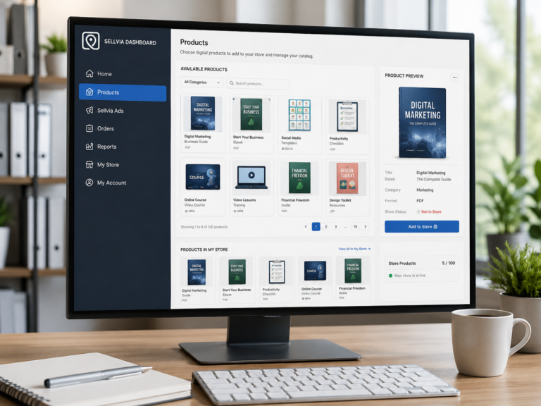
I would not respond by importing as much as possible, though. I prefer a focused store. I explained that approach in Sellvia Product Catalog Explained and How to Add Digital Products to Your Sellvia Store. The product page can be strong on its own and still feel out of place if the surrounding catalog has no clear theme.
What I check in the description
I read the description once as a customer and once as a store owner. Those are surprisingly different passes.
As a customer, I want quick answers. As a store owner, I am checking whether the wording matches the rest of the store and whether the page makes promises I am comfortable presenting.
My checklist is:
- Does the opening explain the product rather than merely advertise it?
- Are the contents specific?
- Does the page explain the practical use case?
- Are important limitations or requirements clear?
- Is the language readable on mobile?
- Does the description match the title and imagery?
- Does the offer remain understandable without relying on exaggerated claims?
I do not rewrite a page just for the sake of making it different. If the prepared page is clear, I would rather keep a good structure than create unnecessary work.
Digital delivery changes what the page needs to explain
Sellvia’s current catalog is centered on digital products such as guides, courses, checklists and similar resources. The current Sellvia Terms also identify digital products such as guides, eBooks and online courses as downloadable digital materials.
That makes the customer question straightforward: what am I getting access to? The product page should make that answer easy to find.
For me, this is a cleaner product-page model than one filled with operational distractions. I can focus on the value and contents of the digital product and then make sure the checkout path is clear.
Price deserves its own review
I never assume that a pre-set price should be ignored simply because the listing is ready. I compare the price with what the page communicates. A higher-priced product needs enough clarity and substance on the page to make the offer understandable.
I also check several products together. If similar products have dramatically different prices, I want to understand why. The goal is not to make every price identical; it is to make the store feel deliberate.
This article stays focused on the storefront mechanics rather than profit calculations. For the broader subscription side, there is a separate Sellvia Pricing Explained guide.
Mobile is not an optional check
After reviewing a listing on desktop, I open it on a phone-sized screen. This is where long headings, oversized images, awkward spacing and buried purchase buttons become obvious.
I specifically check:
- whether the product title wraps cleanly;
- whether the main image fits without dominating the entire first screen;
- whether the price and purchase action remain easy to find;
- whether paragraphs are comfortable to scan;
- whether buttons are easy to tap;
- whether the checkout transition works without layout surprises.
Sellvia’s current store offer is designed around mobile-ready storefronts, and the examples I reviewed reinforce that mobile use is part of the intended experience. I still verify individual listings rather than assuming the theme solves everything automatically.
Product page versus catalog versus checkout
| Area | What I use it for |
|---|---|
| Catalog | Finding and evaluating products that could fit the store. |
| Product page | Checking the actual offer the customer sees before buying. |
| Checkout | Checking the transition from purchase intent to a completed order. |
| Orders | Managing the order after the customer completes the purchase. |
Keeping those stages separate makes the dashboard easier to understand. If I am evaluating copy, I stay on the product page. If I am checking whether an order arrived, I go to Orders.
What I would fix before sending traffic
I would fix obvious clarity problems before starting promotion, but I would not endlessly redesign a page that is already coherent.
My priority order is:
- incorrect or unclear product information;
- price or offer confusion;
- a weak first screen;
- mobile layout problems;
- an unclear purchase action;
- inconsistent presentation with the rest of the store.
Once those basics are sound, I would rather collect real traffic data than keep guessing. Sellvia Reports can then show what is happening at the store level. Our Sellvia Reports Explained guide covers that side of the workflow.
How product pages connect to Sellvia Ads
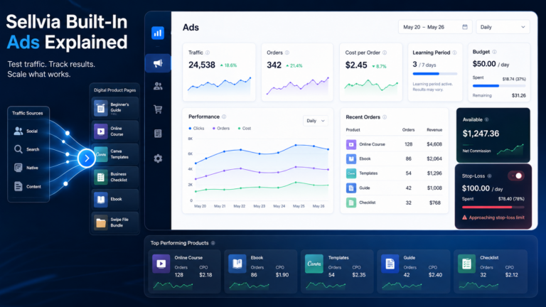
The product page matters even more when traffic is paid. Sellvia’s current guidance describes selecting products for Sellvia Ads and sending campaign traffic into the store. That means the listing has to do its job after the ad gets the click.
I therefore review advertised products more carefully than pages that are simply sitting in the catalog. I want the ad promise and the landing-page offer to feel like the same conversation.
If you are learning that part of the dashboard, see Sellvia Built-In Ads Explained.
My pre-traffic product page checklist
- Open the live product page, not just the dashboard entry.
- Confirm the title immediately identifies the offer.
- Check the main visual and first-screen layout.
- Read the description from beginning to end.
- Verify what the buyer receives is clear.
- Check the customer-facing price.
- Confirm the purchase action is obvious.
- Open the same page on mobile.
- Follow the route toward checkout.
- Compare the listing with neighboring products in the store.
- Only then consider sending advertising traffic.
Frequently asked questions
Does Sellvia provide product pages?
In the current digital-product catalog model, Sellvia describes catalog items as coming with prepared product pages, professional images and descriptions. I still recommend reviewing the live version in your own store before promotion.
Can I review my Sellvia store like a customer?
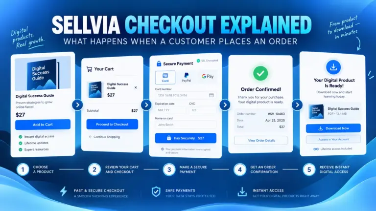
Yes. This is the first thing I do. Open the storefront and move from homepage to product page and toward checkout without relying on the admin view.
What matters most on a digital-product page?
Clarity. The buyer should understand what the product is, what is included, what it costs and how to continue to purchase.
Should every Sellvia product page be rewritten?
No. I would only change something when there is a reason. One advantage of the prepared catalog is avoiding unnecessary listing work. Review first, then improve specific weaknesses.
Where do I see what happens after a customer buys?
That moves into the order workflow. See How to Process a Sellvia Order for the operational side after purchase.
Final takeaway
After going through the current Sellvia storefront model and reviewing live product presentation, I think the strongest part of the product-page workflow is the starting point. A new store owner is not facing an empty listing editor; the catalog is designed around prepared digital-product pages with imagery and descriptive content already in place.
My approach is therefore not to rebuild everything. I inspect the page as a customer, verify the offer and price, check mobile, follow the purchase path, and make targeted changes only where the page actually needs them.
That keeps the process simple and plays to one of Sellvia’s practical strengths: much of the storefront groundwork is already done, while I can focus my attention on whether the final customer experience makes sense before traffic arrives.

Jeck Palmer is an ecommerce writer and platform researcher at Sellvia.info. He specializes in analyzing Sellvia’s features, pricing, tools, advertising system, order workflow, and overall business model. His articles are designed to explain complex platform processes in clear and practical language, helping beginners understand potential costs, evaluate available tools, and make more informed decisions before starting an online business.


One Comment