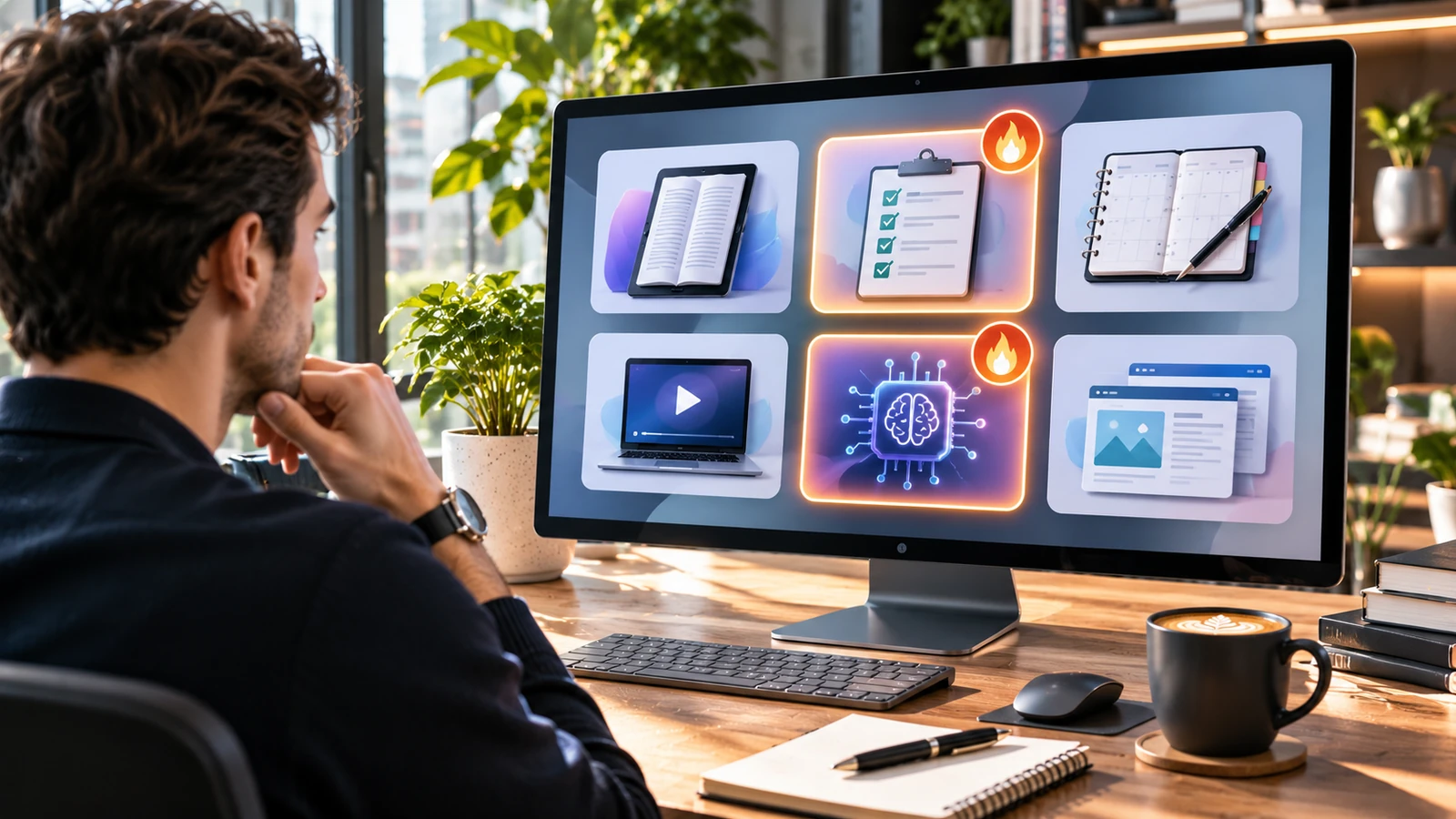
Sellvia HOT Products Reviewed: How Featured Products Stand Out
When I review a featured-product section in an ecommerce platform, I want to know whether it saves the store owner time or merely gives attractive labels to an already crowded catalog. Sellvia’s Products – HOT area is interesting because it can serve as a second layer of selection on top of the ready-made digital-product library. Instead of building a new assortment by scanning every category, a seller can begin with a smaller group of offers that deserve closer attention.
My editorial assessment is positive, but for a specific reason: a featured list helps with discovery and prioritization, not because a badge magically turns a product into a bestseller. Sellvia gives merchants a working storefront and access to digital guides, templates, learning resources and AI-oriented toolkits. A HOT selection becomes valuable when it helps an owner choose which of those resources to examine, position and promote first.
For this review, I compare the HOT selection concept with the product presentation visible across Sellvia’s public digital storefronts. I look at what the label communicates, which features make a selected offer compelling and how a merchant can turn a featured suggestion into a coherent store listing. The aim is a more useful answer than simply telling readers where to click in the dashboard.
What Sellvia HOT Products means in a digital catalog
Sellvia.info’s pricing and catalog coverage identifies a Products – HOT area in the seller dashboard. It is distinct from the normal catalog, where the owner chooses from a broader assortment. That distinction makes sense. A large catalog is useful for range; a highlights section is useful for attention. The two solve different problems.
The important phrase here is featured products. It describes how an offer is presented for consideration. It does not establish an independently audited sales rank, a minimum conversion rate or a promise that the same product will sell in every store. I treat the HOT designation as a shortlist and then apply the same editorial checks I would use on any digital resource.
That is a strength rather than a weakness. Sellers rarely need more unfiltered options. They need a manageable way to identify products with a clear audience, a recognizable problem and enough substance to explain in an advertisement. Highlighting candidates can shorten that first round of research.
Sellvia’s public Mall pages also use consumer-facing labels such as "Bestseller" and "Hot Products Spot" on some listings. Those badges belong to the public marketplace presentation and should not be confused with a particular merchant’s private Products – HOT dashboard. I use such pages to evaluate what a buyer sees, while treating the seller catalog and marketplace as separate interfaces.
The first thing I notice: the best offers explain a result
A good featured product does not need a dramatic name. It needs a buyer who can immediately recognize why the material is relevant. Consider a planning guide that helps somebody prepare a difficult week. Its appeal comes from a clear starting problem: too many obligations, unclear priorities and limited time. A useful title and summary promise a concrete planning method, not general motivation.
This is why I regard Sellvia’s digital-product direction favorably. A finished digital offer can be communicated through the outcome it helps a buyer work toward. There is no need to invent a complicated product narrative. A checklist organizes a procedure. A course teaches a sequence. A template makes a recurring task easier. An AI toolkit guides an interaction with technology.
In a featured area, that clarity matters more than decorative urgency. If I cannot answer "what does this help the customer do?" after reading the visible listing, the HOT marker adds very little. If the answer is obvious, the same product can anchor a search snippet, social post, email or dedicated category page.
Four public examples that show the appeal of focused digital offers
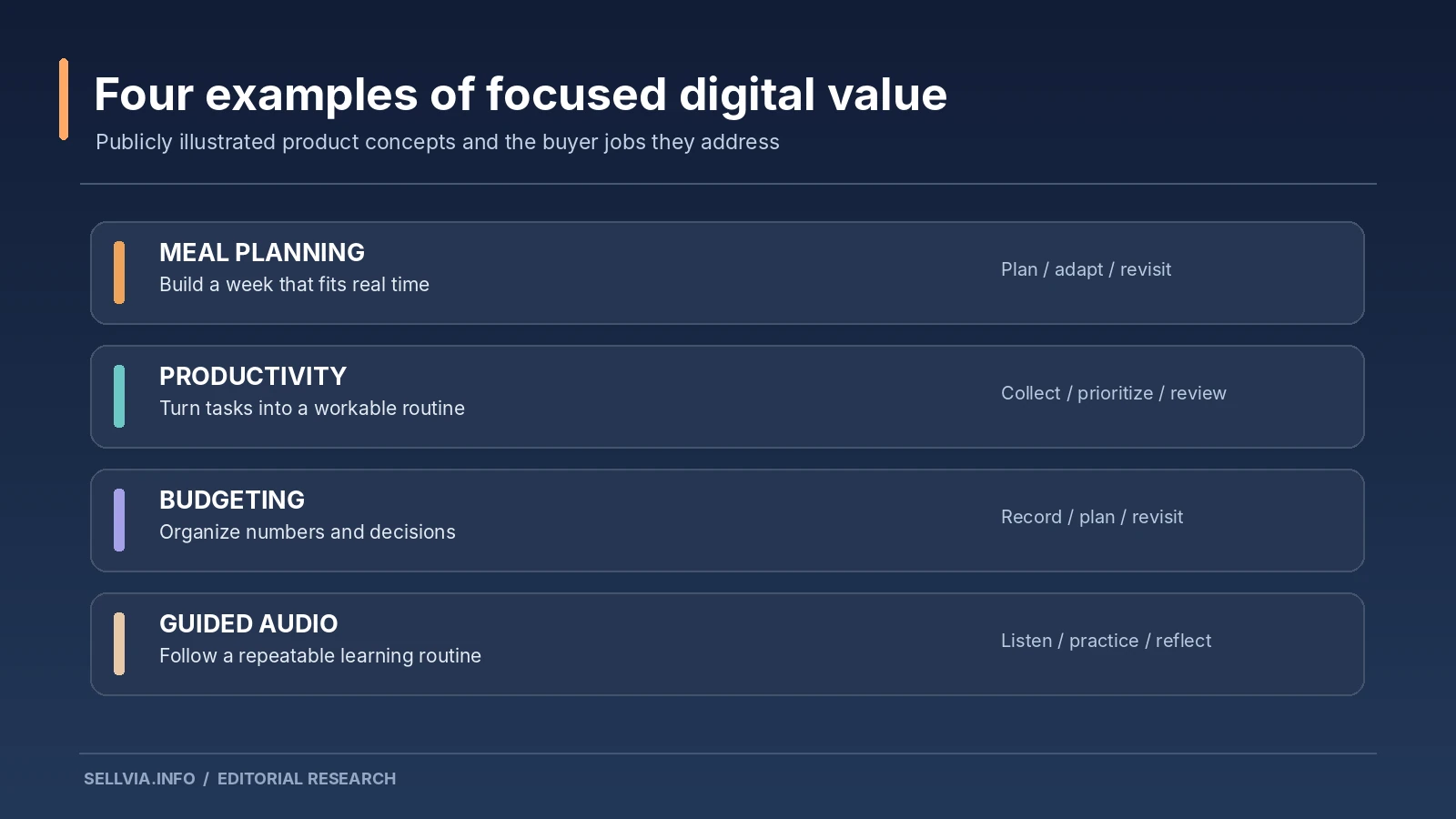
The public Sellvia Mall is useful for observing presentation patterns. It is not the same as the products assigned to every subscriber account. Here are four listings or listing types that demonstrate why narrow use cases work well in a highlights strategy.
The Weekly Meal Planning System presents itself around a realistic weekly routine rather than the abstract idea of healthy eating. Its public description discusses day-by-day constraints and a browser-based planning workflow. That is a persuasive concept because the product’s function is easy to picture before purchase. In editorial terms, the benefit is a repeatable planning activity, not an unverifiable transformation claim.
Personal AI Productivity Companion Toolkit is presented as a multi-part productivity resource. The public page identifies a collection of components aimed at organizing tasks and planning. The strongest selling angle is not the presence of the letters "AI". It is the idea of connecting several related tasks in a recognizable workflow. A merchant should still read the exact component description before treating the offer as appropriate for a particular customer.
The Empowered Budgeting Toolkit is publicly listed as a four-part digital bundle including budgeting and planning resources. This type of offer is easy to position for a customer who wants a structured place to start. Its materials are presented as connected components instead of isolated downloads. I would emphasize the concrete budgeting aids and avoid implying professional financial advice or guaranteed results.
Sleep Reset: Guided Audio Course for Restful Nights demonstrates a different format: an audio-oriented learning experience. It provides a useful contrast to PDFs and templates. The merchant can explain how the customer uses the material and when it fits into a routine. Health-related claims, however, need particularly careful wording. A title can be inviting without promising to treat a condition.
These examples reveal a pattern: specific format + specific user + specific task. That is the combination I want to see in any HOT selection. Whether a particular listing is present in an individual store must be confirmed in that store’s catalog.
Featured placement helps sellers narrow the decision
An owner who opens a large library can lose an afternoon comparing products that have little connection to each other. HOT selections can make the first decision easier by offering a candidate set. The next move should be filtering, not immediately adding everything.
I would begin by asking whether the featured item fits the site’s existing identity. A productivity store can reasonably consider a weekly planner, focus guide and scheduling toolkit. A pet-focused store probably needs a different selection. The same featured product may be useful in one context and distracting in another.
Then I check the product page. Is the title descriptive? Does the opening specify the deliverable? Are the contents presented in ordinary language? Can the visitor understand the purchase without relying on an artificial countdown or an unexplained claim of popularity?
This evaluation takes less effort when Sellvia supplies ready-made descriptions and imagery. The owner is reviewing a complete offer rather than inventing a product page from scratch. That is a tangible benefit of the platform’s approach to merchandising.
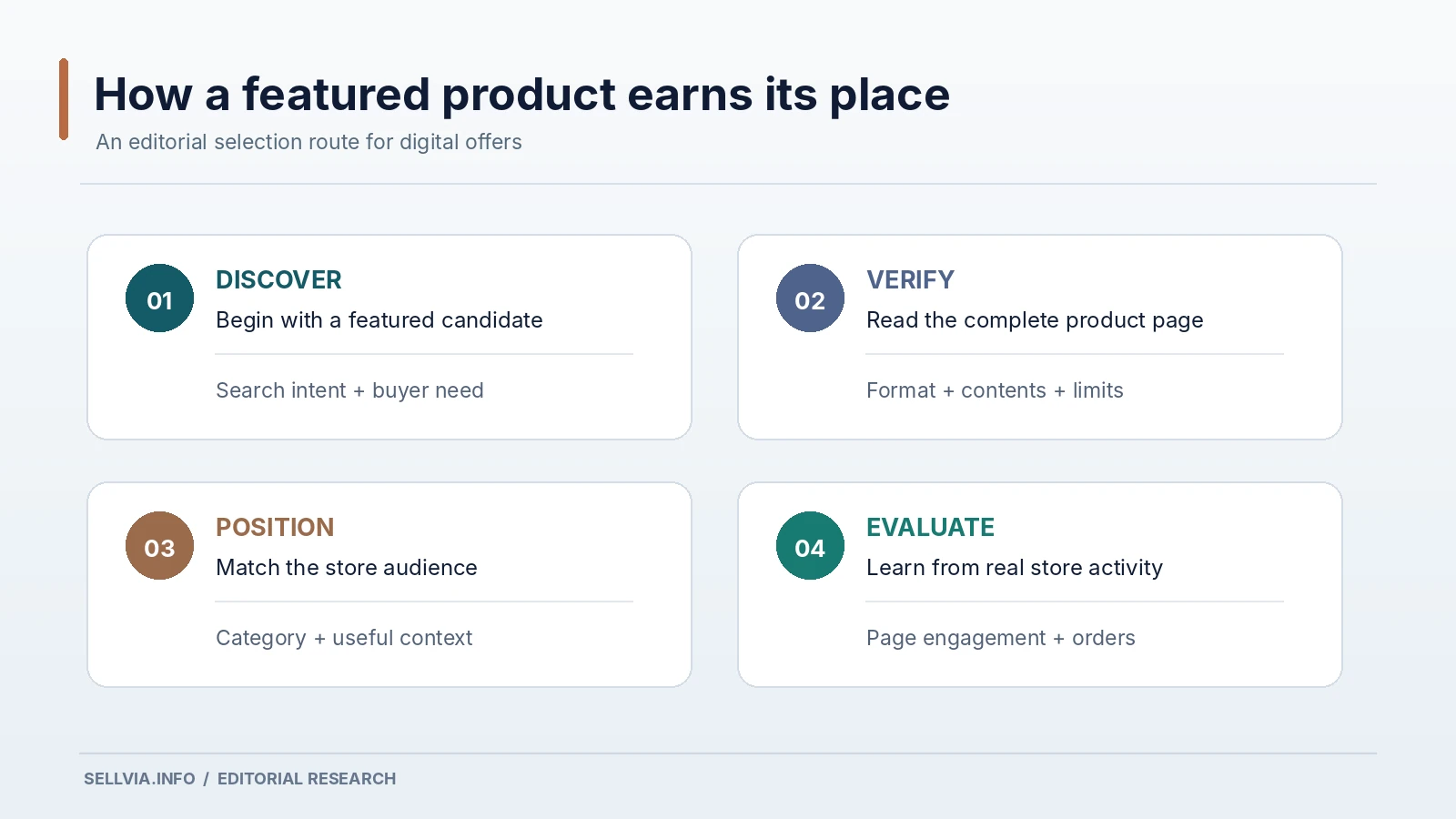
My editorial filter for HOT product candidates
I use six questions when deciding whether a highlighted digital item deserves a prominent store position. First, does it solve one identifiable problem? Second, is the intended audience specific enough for a clear description? Third, is the format appropriate for the task? Fourth, can the contents be explained honestly? Fifth, does it fit the neighboring catalog? Sixth, is there a natural way to show the customer what they can do with it?
These are not numerical bestseller predictions. They are quality controls that improve how a merchant uses a featured list. A product passing all six gives the owner material for a convincing landing page and an understandable campaign. A product with a strong badge but a vague promise needs more examination.
The fifth question is regularly overlooked. A store should not become an endless grid of unrelated digital thumbnails. Buyers infer credibility from what sits next to the item they are considering. A coherent assortment signals that the seller understands a particular problem area.
Why presentation matters as much as selection
A highlighted product may arrive with prepared imagery, but the surrounding page still shapes the customer’s impression. I review the first screen as if I had clicked a link from a search result. The title, visual, short summary, price and purchase action should tell one consistent story.
For a meal-planning resource, I would emphasize the planning outcome and what the customer can edit or save. For an AI productivity guide, I would emphasize the actual steps and formats described in its listing. For a budgeting toolkit, I would distinguish educational organization tools from personalized financial services. In each case, the point is to reduce uncertainty.
This is one area where Sellvia’s ready-made pages offer a genuine convenience. A merchant begins with a formatted listing, not an empty page. That structure is a solid foundation for reviewing mobile readability, tightening the headline and deciding whether the item should sit on the homepage.
The broader mechanics of the customer-facing listing are covered in Sellvia Product Pages Explained. Here the focus is the extra merchandising decision: what should be featured and why?
A simple featured-products lineup that makes sense
Imagine a store centered on weekly organization. I would lead with a planning system, follow with a task-prioritization resource and add a focused AI workflow where it has a clearly defined job. The homepage could present these as "Plan your week," "Choose your priorities" and "Turn a plan into repeatable steps."
Notice what this lineup avoids. It does not need a dozen unrelated products to look complete. It gives the visitor a sequence: start, organize, repeat. That sequence creates opportunities for internal navigation, related-product suggestions and useful editorial content without overstating demand.
A featured area can be especially helpful at the beginning of this process. The seller sees candidates, selects the ones that genuinely belong together and builds an understandable offer around them. The value lies in reducing the amount of unfocused browsing between the initial store setup and the first thoughtful assortment.
How I would test a new HOT item before promoting it
The first pass is a store audit. I open the listing and read it without looking at the HOT label. That forces the product to stand on its own. I then compare the offer with the site’s existing category and check whether a visitor could understand the connection.
Next I record the product’s exact title, format, included components and any usage requirements. This matters when the same broad theme can cover very different resources. A downloadable guide is not the same as an interactive HTML planner. A collection of prompts is not automatically an AI application. Clear categorization makes marketing more accurate.
Finally I consider the destination page. Is it easy to find from the homepage? Does it work on a phone? Do its title and description match the language I would use in an ad? A thoughtful featured decision improves little if the buying page is confusing.
The deeper process of selecting from the wider library belongs in Sellvia Product Catalog Explained. The HOT area should be an editorial shortcut inside that process, not a substitute for it.
What a HOT badge can and cannot tell you
Highlighting helps direct attention. It does not reveal why a product was selected unless the platform supplies that information. A HOT label, a public bestseller badge, a review count and an account-level performance report are four different types of signal.
I would not combine them into one fictional statistic. If a seller wants to understand which products customers actually purchase in their store, the reliable place to begin is the account’s own order and reporting data. If a product attracts clicks but not purchases, that is useful information about the offer, traffic or page; it does not become a successful seller merely because it was initially featured.
This matters for a positive review. The strongest case for Sellvia HOT Products is not a promise of automatic revenue. It is that the platform reduces the friction of product discovery and supplies an organized starting point for a real merchandising decision.
Pairing HOT selections with advertising responsibly
A highlighted item is an obvious candidate for promotion, but paid traffic introduces a separate question: does the audience respond to the offer? I would first make sure the listing accurately describes the digital material and the store can handle the purchase path. Only then is there a reason to test the product with an advertising campaign.
When comparing candidates, keep the evaluation consistent. Different creative messages and audiences produce different results even for the same offer. A product that gets attention from the wrong audience may appear weaker than it is. Likewise, an attractive headline cannot compensate for an unclear deliverable.
Sellvia’s advertising environment connects naturally with its catalog workflow, and that connection is useful for a beginner. Product choice and promotion are part of the same operating system. For the measurement side, see Sellvia Ads Metrics Explained. I would not confuse promotional readiness with proven advertising profitability.
What I would improve in a featured selection
My main suggestion is editorial, not technical: make the reason for featuring a product obvious to the customer. A "popular" designation is less informative than a concise explanation of the task the resource helps with. The copy should connect product type, buyer need and likely usage.
I would also group featured offers into small thematic collections instead of arranging them as a long row of unrelated products. A visitor interested in improving a daily routine is more likely to consider a second relevant resource than an item from an entirely unrelated subject. Logical grouping is not only tidier; it helps the site communicate expertise.
Finally, the owner should periodically revisit featured pages. Digital topics evolve, especially AI workflows and rapidly changing software-related guidance. A product can remain relevant for years, but references and instructions should still reflect the tools customers actually use.
Our editorial verdict: a useful shortcut, not a substitute for judgment
I like the role that HOT Products can play in Sellvia’s ecosystem. It turns a broad source library into a more manageable selection exercise. Coupled with ready-made product pages, the highlighted-product concept gives a seller an efficient place to begin building a focused assortment. The most practical advantage is saving research and setup time while keeping the merchant in charge of the final choices.
The strongest stores will use the feature selectively. They will pick digital offers that fit their audience, explain the value plainly, keep the page accurate and then study how customers respond. That is a more durable approach than treating a HOT badge as a performance guarantee.
For a new Sellvia owner, my recommendation is straightforward: use the highlighted area for discovery, choose a short thematic lineup, inspect each deliverable description and present the chosen products with clear buyer-focused language. In that role, HOT Products is a genuinely helpful part of a ready-made digital storefront.
Frequently asked questions
Is Products – HOT the same as the full Sellvia catalog?
No. The HOT area is a featured selection concept, while the full catalog covers a wider range of digital resources. The two areas support different decisions: shortlisting and broader discovery.
Does a HOT product guarantee strong sales?
No product label guarantees orders. Actual results depend on the audience, page, offer and promotion. A featured item is a useful candidate to evaluate, not a substitute for evidence from your own store.
Are HOT labels on Sellvia Mall the same as dashboard recommendations?
Not necessarily. Mall pages show public marketplace merchandising, while Products – HOT is an account-side area. Check what is available and featured in the specific seller account.
Which featured digital products work best together?
Those solving related problems for the same buyer. Planning resources, practical checklists and a complementary workflow toolkit can create a clearer offer than unrelated products chosen only because they have a badge.
Should I change every prepared product page?
No. Sellvia’s prepared presentation is part of its value. Review the page first, then improve only details that affect clarity, accuracy, relevance or the customer journey.
What is the most important signal after adding a featured product?
Look at how real visitors engage with its page and whether the resulting orders make sense for the store. Treat store-level performance as separate from the product’s initial featured designation.

Joe Radmon is a digital commerce researcher and contributing author at Sellvia.info. His work focuses on the practical mechanics behind Sellvia, from subscription costs and advertising budgets to order processing, account balances, and payout planning. Joe is particularly interested in how platform features affect everyday business decisions. His articles aim to replace vague expectations with clear explanations, realistic examples, and useful context for readers evaluating Sellvia as an online business platform.