
Sellvia My Store Explained: Store Settings, Pages and Controls
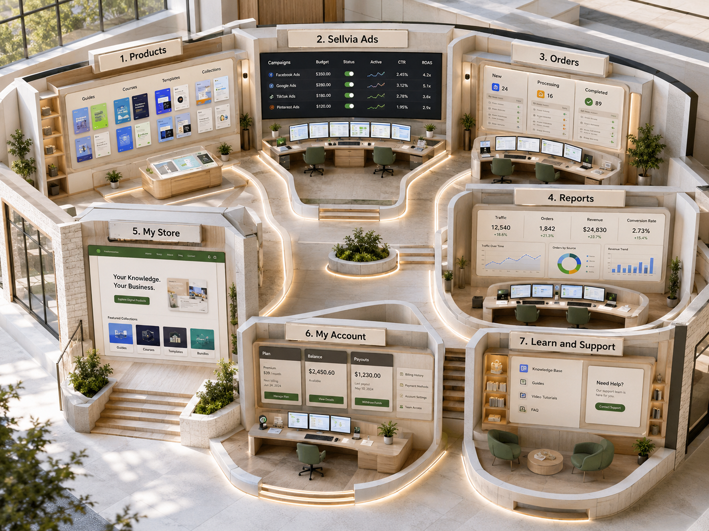
Sellvia My Store is best understood as the part of the Sellvia workflow where the storefront itself becomes something you can inspect, organize, and prepare for customers. The dashboard gives you the wider operating picture—products, orders, reports, advertising, balances, and account tools—but the store side is where those systems meet the customer-facing website.
That distinction is useful for beginners because it prevents a common mistake: treating the store as a single page that is either “finished” or “unfinished.” In practice, a working Sellvia store is a combination of the storefront, product selection, product pages, pricing, navigation, checkout, domain, customer-facing policy pages, and the operational links back to the dashboard. Each part answers a different question.
Sellvia My Store: Quick Answer
Use the store area to review the website customers actually see, confirm which digital products are available, inspect product presentation and pricing, verify the domain and navigation, and test the path from product page to checkout. The exact labels can vary as Sellvia updates the interface, but the operating principle is stable: dashboard tools manage the business, while the storefront is the customer-facing result.
Before sending paid or organic traffic, open the store as a customer, check several product pages, confirm prices and descriptions, inspect the main navigation and policy/contact pages, and complete a full test of the purchase path. Then return to the dashboard to monitor orders, reports, and advertising.
What “My Store” Means Inside Sellvia
Sellvia currently positions the store as a ready-to-use digital commerce storefront connected to the rest of the platform. Recent Sellvia guidance describes the account dashboard as the place where the store, product catalog, orders, advertising, analytics, and educational tools are managed together. The storefront is therefore not an isolated website; it is the customer-facing layer of the same operating system.
For a new account, this usually means there is already a functioning store to review rather than an empty website that must be built from scratch. Current Sellvia Academy guidance tells new users to start by opening the storefront as a customer, reviewing the products already present, checking pricing and descriptions, and understanding the checkout flow before making large changes. That is a sensible way to think about My Store: inspect first, change second.
If you are still unfamiliar with the surrounding interface, our Sellvia Dashboard Overview explains where store management fits alongside Orders, Reports, Sellvia Ads, balances, and payouts.
Storefront
The public website customers browse before buying.
Products
The digital items currently visible and available for purchase.
Product pages
The title, visuals, description, price, and buying context for each item.
Navigation and pages
The structure that helps customers move through the store and find key information.
Checkout path
The sequence from choosing a product to completing a purchase.
Domain access
The web address customers use to reach the store.
Start With the Customer View
The fastest way to understand the store is to leave the administrative mindset for a few minutes and browse it like a first-time visitor. Sellvia’s current launch guidance recommends exactly this: open the storefront, move through the homepage, visit product pages, and look at the checkout flow before you start changing things.
This matters because dashboard settings can feel abstract. A product title in the catalog is just a field until you see how it appears on a mobile screen. A navigation menu may look acceptable in an editor but confusing on the live storefront. A price can be technically correct while still being hard to notice next to the main call to action.
When reviewing the live store, check four levels:
- Homepage clarity: Can a visitor understand what the store offers within a few seconds?
- Category and browsing flow: Is it easy to move from the homepage to relevant digital products?
- Product-page clarity: Does each page explain what the buyer receives and why it is useful?
- Purchase path: Is the movement from product selection to checkout obvious and uninterrupted?
Useful rule: do not judge the store only from desktop admin screens. Check the public storefront on both desktop and mobile because the customer experience—not the editor—is what determines whether the store feels coherent.
Products: What Is Actually Available in the Store?
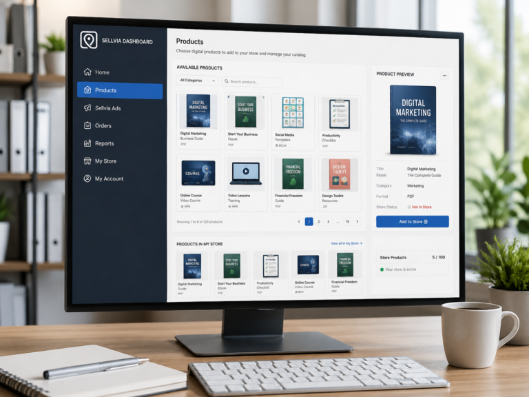
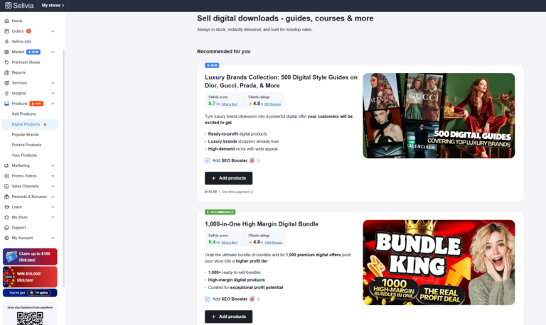
The product catalog and the live store are related but not identical. The catalog is the larger source of digital products available through Sellvia, while the store is the curated set that customers currently see. Sellvia’s recent onboarding material describes stores as launching with a pre-loaded selection and then allowing the owner to review that starting catalog and expand it later.
That creates two different tasks. First, decide whether the products currently visible in the store form a coherent offer. Second, decide whether additional products from the wider catalog would strengthen that offer. Adding more is not automatically better. A smaller store with a clear theme can be easier to understand than a large store filled with unrelated items.
Before adding products, ask:
- Does this item fit the store’s current topic or audience?
- Does it overlap heavily with something already listed?
- Would a customer understand why it belongs beside the other products?
- Is the price consistent with the rest of the catalog?
- Does the product page clearly describe the digital deliverable?
Our upcoming dedicated catalog guide will go deeper into importing and organizing products. For now, the main point is that My Store should represent a deliberate selection, not merely everything available in the catalog.
Product Pages: The Main Decision Point
Most customers will make the purchase decision on a product page, not inside your dashboard. That makes the product page one of the most important elements to verify before traffic starts arriving.
A useful product page should answer the buyer’s practical questions without making them search elsewhere. What is the product? What does it contain? Who is it for? What result or use case does it support? What does it cost? What happens after purchase?
Sellvia’s current digital-product model is based on products that can be delivered electronically after purchase. Because of that, product-page clarity matters more than operational explanations that would be relevant to a physical fulfillment model. The customer needs to understand the digital item and the value of receiving it, not a logistics process.
| Store element | What to verify | Why it matters |
|---|---|---|
| Product title | Specific and understandable wording | Visitors should know what the item is without decoding marketing language. |
| Primary image | Relevant to the digital product | The image creates the first visual expectation. |
| Description | Explains contents, use case, and buyer outcome | Reduces uncertainty before checkout. |
| Price | Correct and easy to see | Prevents surprise later in the purchase path. |
| Call to action | Clear next step | The buyer should not have to guess how to continue. |
| Mobile layout | Readable without awkward spacing | A large share of traffic may arrive on phones. |
Pricing: A Store Setting That Affects More Than Revenue
Pricing belongs to the store-management process because it changes how the customer reads the offer. The number shown on the product page is not just an accounting input; it is part of product positioning.
Sellvia’s current onboarding material explicitly recommends reviewing default pricing on the pre-loaded store before launching traffic. That does not mean every price needs to be changed. It means you should know what customers will see and make sure the catalog feels internally consistent.
On sellvia.info we treat pricing controls as an operating topic, not a profitability calculation. If you need the wider cost structure, see our separate Sellvia Pricing Explained guide. My Store is concerned with the customer-facing price and how it is presented inside the storefront.
Pages and Navigation: The Structure Around the Products
A digital-product store still needs more than product cards. Customers need context and a clear way to find important information. That is why the pages surrounding the catalog matter.
Current Sellvia Academy guidance for digital-product stores highlights several basic customer-facing pages, including an About page, a refund or policy page, and a contact path. The exact page set can differ by account and template, but the principle is straightforward: important questions should have a visible answer somewhere on the storefront.
When reviewing the store structure, look for:
- About information that explains what the store offers.
- Contact access so customers know where to send questions.
- Policy information that sets expectations before purchase.
- Product/category navigation that makes browsing predictable.
- A consistent route back to the homepage from deeper pages.
A navigation menu should be short enough to scan quickly. If every possible destination is placed in the primary menu, the most important options become harder to see. Secondary information can usually live in the footer.
Domain: How Customers Reach the Store
The domain is one of the store’s most visible settings because it is the address customers type, click, and share. Sellvia has historically offered turnkey stores with a domain selected during the setup process, and its support guidance notes that an existing domain can also be connected in supported cases.
If a store is already receiving traffic, changing the domain is not a cosmetic action. Sellvia support warns that a domain switch can affect existing promotion and SEO, so an established store should treat that change carefully and coordinate it with support rather than experimenting casually.
For a new store, the practical checks are simpler:
- Does the domain load the correct storefront?
- Does HTTPS work without browser warnings?
- Do the homepage and product pages use the same canonical domain?
- Does the domain look credible when shared in social profiles or ads?
- Are you planning to keep it long enough to avoid unnecessary switching?
Checkout: Where Store Configuration Becomes an Order
The checkout is the boundary between the customer-facing store and the operational dashboard. Everything before checkout is browsing and evaluation. A completed purchase creates an order that then appears inside Sellvia’s order workflow.
That is why a store review is incomplete until you test the full path. Open a product, move through the buying process, and make sure there are no confusing jumps, broken pages, unexpected price displays, or missing information.
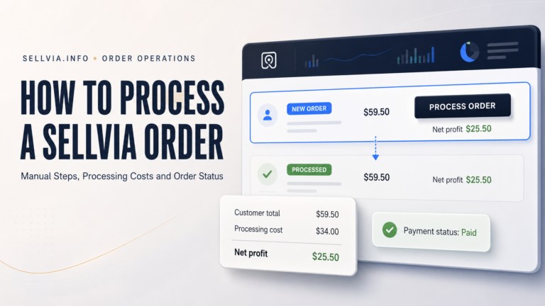
Once a real customer completes a purchase, the next operational step moves to Orders. Our How to Process a Sellvia Order guide explains that workflow separately. Keeping these topics separate prevents confusion: My Store manages the customer path; Orders manages what happens after the purchase is created.
My Store vs Dashboard: Which Screen Should You Use?
New users often keep returning to the storefront when the answer they need actually lives elsewhere. The easiest way to avoid that is to match each question to the correct dashboard area.
| Question | Best place to check |
|---|---|
| What does the customer see? | Storefront / My Store |
| Which products are available to add? | Product catalog |
| Did a customer place an order? | Orders |
| How is traffic converting? | Reports |
| Are ads active and producing data? | Sellvia Ads |
| Where are earnings in the balance workflow? | Balance |
| Can funds be withdrawn? | Payouts |
For traffic and store activity, read our Sellvia Reports Explained guide. For advertising controls, the Sellvia Built-In Ads Explained article covers the platform’s advertising layer.
What Not to Change Immediately
Sellvia’s current onboarding advice makes an important point: new users should first understand the existing store before redesigning everything. That is useful because an early account does not yet have enough performance data to tell you which elements actually need changing.
Three types of premature changes create unnecessary noise:
- Changing many products at once. If performance changes, you cannot tell which adjustment mattered.
- Rebuilding the storefront before testing it. You may remove useful structure before understanding how it works.
- Reacting to one or two days of traffic. Very small samples can make normal variation look like a problem.
A better process is incremental. Review the store, fix obvious clarity issues, test the purchase path, send traffic, read Reports, and then make one meaningful change at a time.
Sellvia My Store Pre-Launch Checklist
- Open the storefront on desktop and mobile.
- Confirm the homepage clearly communicates the store topic.
- Review at least five product pages.
- Check product titles, images, descriptions, and prices.
- Confirm the main navigation is short and understandable.
- Verify About, contact, and policy information is accessible.
- Check the domain and HTTPS connection.
- Walk through the product-to-checkout path.
- Know where new orders will appear in the dashboard.
- Know where Reports will show visitors, orders, conversion rate, and revenue.
- Check Sellvia Ads only after the customer-facing path is ready for traffic.
If you are still learning the full sequence, our Sellvia for Beginners guide connects store setup with the rest of the account workflow.
Common My Store Mistakes
1. Treating the live store and product catalog as the same thing
The catalog is a source of products. The storefront is the customer-facing selection. Adding everything can weaken the store’s focus.
2. Editing without checking the public result
Always verify changes on the live storefront. Administrative controls do not show exactly how every page feels to a visitor.
3. Ignoring mobile
A store that looks clean on a large monitor can still have awkward spacing or difficult navigation on a phone.
4. Using Reports to answer a store-design question
Reports can tell you that conversion changed; it cannot by itself tell you which sentence, image, or menu item caused the change. Use data to identify where to investigate, then inspect the relevant store elements.
5. Confusing revenue with available funds
The storefront creates sales, but the financial workflow continues after the order. Revenue shown in Reports is not the same as Available balance. See Sellvia Balance Explained for that distinction.
Sellvia My Store FAQ
What is Sellvia My Store?
It is the store-management side of the Sellvia workflow: the customer-facing storefront, products, product presentation, navigation, domain, and purchase path connected to the wider Sellvia dashboard.
Can I change the products in my Sellvia store?
Sellvia’s current guidance describes a pre-loaded starting catalog and access to a wider product catalog for expansion. Review the existing store first, then add products that fit the same audience and theme.
Should I redesign my Sellvia store immediately?
Usually not. Sellvia’s current onboarding guidance recommends first reviewing the store as a customer and understanding the existing structure before making large changes.
Can I use my own domain with Sellvia?
Sellvia support has documented custom-domain use for supported store setups. If the store is already receiving traffic, coordinate a domain change carefully because it can affect promotion and SEO.
Where do I see orders after a customer buys?
Completed customer purchases move into the Orders section of the dashboard. The storefront handles the customer journey; Orders handles the operational workflow after purchase.
Where do I check whether the store is converting?
Use Sellvia Reports. That area currently summarizes metrics such as unique visitors, total orders, average order value, conversion rate, and total revenue for the selected period.
What should I check before running Sellvia Ads?
Confirm the storefront loads correctly, product pages are understandable, pricing is visible, the domain works, important pages are accessible, and the checkout path works from start to finish.
Final Takeaway
Sellvia My Store is not a separate business system—it is the customer-facing layer of the Sellvia account. The dashboard manages products, orders, reports, ads, balances, and account operations. The store turns those settings into a website a customer can actually browse and buy from.
The most useful way to manage it is sequentially: review the existing storefront, confirm the product selection, inspect product pages and pricing, verify navigation and key pages, check the domain, test the checkout path, and only then use Reports and Ads to evaluate what happens when traffic arrives.
That workflow keeps store changes connected to real operational questions. Instead of redesigning at random, you know which part of Sellvia to inspect next—and why.
Source note: This guide was checked against current Sellvia Academy material on launching and reviewing a digital-products store, current Sellvia public store information, and Sellvia support guidance on domain changes. Interface names and account-specific controls can change, so the live dashboard remains the final reference for an individual account.

Jeck Palmer is an ecommerce writer and platform researcher at Sellvia.info. He specializes in analyzing Sellvia’s features, pricing, tools, advertising system, order workflow, and overall business model. His articles are designed to explain complex platform processes in clear and practical language, helping beginners understand potential costs, evaluate available tools, and make more informed decisions before starting an online business.

3 Comments